First impressions matter, and this is especially true for websites. A well-designed layout is critical to attracting and engaging visitors. It helps them navigate your content, improves readability, and ultimately enhances user experience (UX).
One common challenge WordPress users face is the need to adjust layouts to better suit the content and target audience. This includes optimizing layouts for different screen sizes, ensuring responsiveness across devices, and organizing content in a way that is intuitive and easy to navigate. While the traditional container-based layout system in WordPress is functional, it can sometimes limit design flexibility and prevent you from creating dynamic, visually appealing pages.
This article dives into the concept of how to convert from container to column WordPress. We’ll walk you through a step-by-step process within your WordPress dashboard, empowering you to create a more flexible, user-friendly, and visually stunning website – all without needing extensive coding knowledge.
Let’s get started!
What are Containers and Columns in WordPress?
Understanding the distinction between containers and columns is essential when exploring how to convert from container to column WordPress.
Containers are structural elements that hold and organize content on a web page. In WordPress, containers are usually represented by the main content area where posts, pages, and widgets are displayed. Essentially, they act as boxes in which text, images, videos, and other components are grouped. Think of them as sections on a page, separating content and creating a sense of visual hierarchy. Containers can be full-sized, take up the entire page, or they can have specific dimensions.
Columns, on the other hand, refer to horizontal sections within a container that allow you to organize content and customize the layout. They provide a more structured and visually appealing way to present content, making it easier for users to scan and navigate the site. They provide greater design flexibility than containers, allowing you to place text, images, and other elements next to each other.
WordPress offers various methods to create columns, including built-in features like the Gutenberg editor’s block-based layout options and plugins such as page builders like Elementor, Divi, or WPBakery.
Both containers and columns play a crucial role in web design, influencing aspects directly related to converting from containers to columns within a WordPress dashboard:
- They help structure content logically, making it easier for users to understand the hierarchy of information and find the information they need.
- Organizing content into specific sections, containers and columns creates a more visually balanced and aesthetically pleasing layout.
- They ensure that layouts adapt effectively to different screen sizes, optimizing the display of the site for desktops, tablets, and mobile devices.
- Through the use of columns, designers and developers can be more flexible in customizing layouts, experimenting with different design patterns and creating unique page structures to meet specific content needs
Essentially, understanding and utilizing containers and columns in WordPress allows website builders to develop engaging, user-friendly, and responsive websites that leave a lasting impression on visitors.
Why Convert from Container to Column?
As a WordPress website owner, staying ahead of design trends is crucial for delivering an engaging user experience. While container layouts offer a foundation, they can sometimes feel dated and limit design flexibility.
Transitioning to a column layout in WordPress unlocks a new level of creativity and caters to user preferences, potentially through the use of the built-in editor or a page builder plugin:
- Improved Design & Visual Appeal: Columns offer a dynamic way to organize content. They allow you to create visually appealing sections, each showcasing unique content elements such as blog posts, product features, or portfolios. This flexibility allows you to create more interesting and visually appealing websites.
- Improved User Experience: By breaking content into organized columns, you make it easier for users to scan and navigate your site. This clarity reduces confusion and leads to a more positive user experience.
- Responsive Design: In today’s mobile-first world, responsive design is crucial. Column layouts naturally adapt to different screen sizes compared to container layouts. This ensures your website displays optimally on desktops, tablets, and mobile devices, providing a seamless experience for all visitors.
- Modern and Stylish: Columns add a touch of modernity to your website’s design. If you’re looking for a fresh and visually captivating aesthetic, converting to columns can be a strategic move.
- Effective Media Display: Column layouts are well-suited for showcasing media elements like images and videos. You can create visually appealing galleries or highlight multimedia content more effectively within a column structure.
Converting from container to column isn’t just about aesthetics; it’s a strategic move to enhance your website’s responsiveness, user experience, and overall appeal. It’s about creating a website that looks great, functions seamlessly, and leaves a lasting impression on your audience.
Guide to Conversion: How to Convert from Container to Column in WordPress
Ever feel like your website’s layout is a bit…well, boxy? Container layouts, while functional, can sometimes make your website look outdated and limit your design options. But fear not, website warriors! Converting to a column-based layout injects a breath of fresh air into your website and unlocks a world of creative possibilities.
Step 1: Backup Your Website
Before you make any changes to the layout of your website, you should create a backup. This will ensure that you have a reliable copy of your site in case something goes wrong during the conversion process. You can use WordPress plugins like UpdraftPlus or BackupBuddy to easily back up your entire site, including files, databases, and media content.
Step 2: Choose a Page Builder Plugin (Optional)
If you’re not already using a page builder plugin that supports column-based layouts, such as Elementor, Divi, WPBakery, or Beaver Builder, consider installing one. These plugins offer intuitive drag-and-drop interfaces for designing and customizing your website’s layout, including creating columns easily.
Once you’ve selected a page builder or plugin, install and activate it on your WordPress dashboard. Follow the installation instructions provided by the plugin or page builder to ensure proper setup and compatibility with your WordPress theme.
Step 3: Access the WordPress Dashboard
Log in to your WordPress dashboard using your admin credentials.
Step 4: Navigate to the Page or Post You Want to Convert
Select the page or post where you want to convert the layout from container to column. You can do this by going to Pages or Posts in the dashboard and then clicking on the specific page or post.
Step 5: Edit the Page/Post with the Page Builder Plugin
If you’re using a page builder plugin, click on the “Edit with [Page Name]” button to launch the interface.
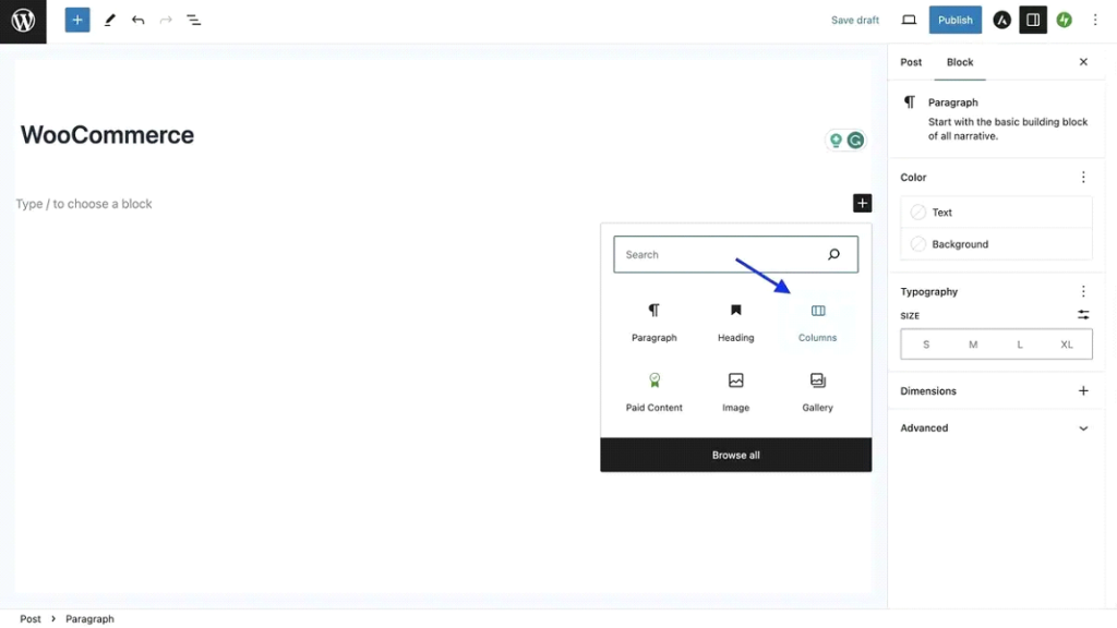
Step 6: Add Columns
Within the page builder interface, look for options to add columns. This may vary depending on the plugin you’re using but typically involves dragging and dropping column elements onto your page.
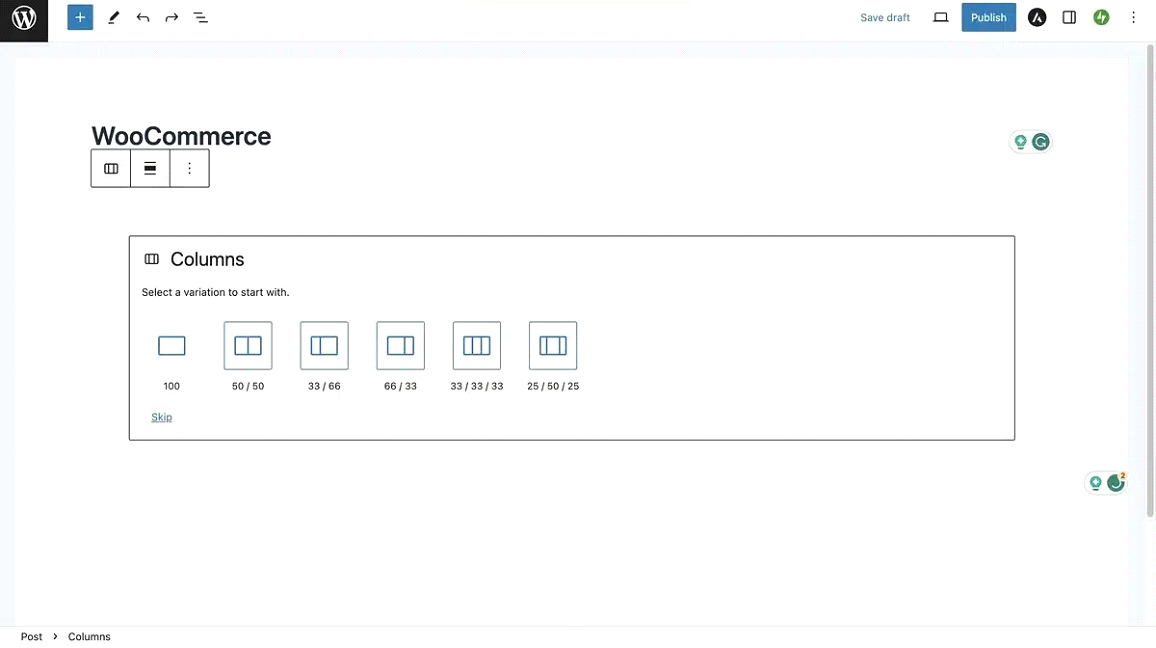
Step 7: Customize Column Layout
Using the features and tools provided by the selected plugin, create and customize columns on your page. Generally, you can add columns, adjust the width of columns, add content elements (text, images, videos) and design columns according to your site’s design aesthetics.
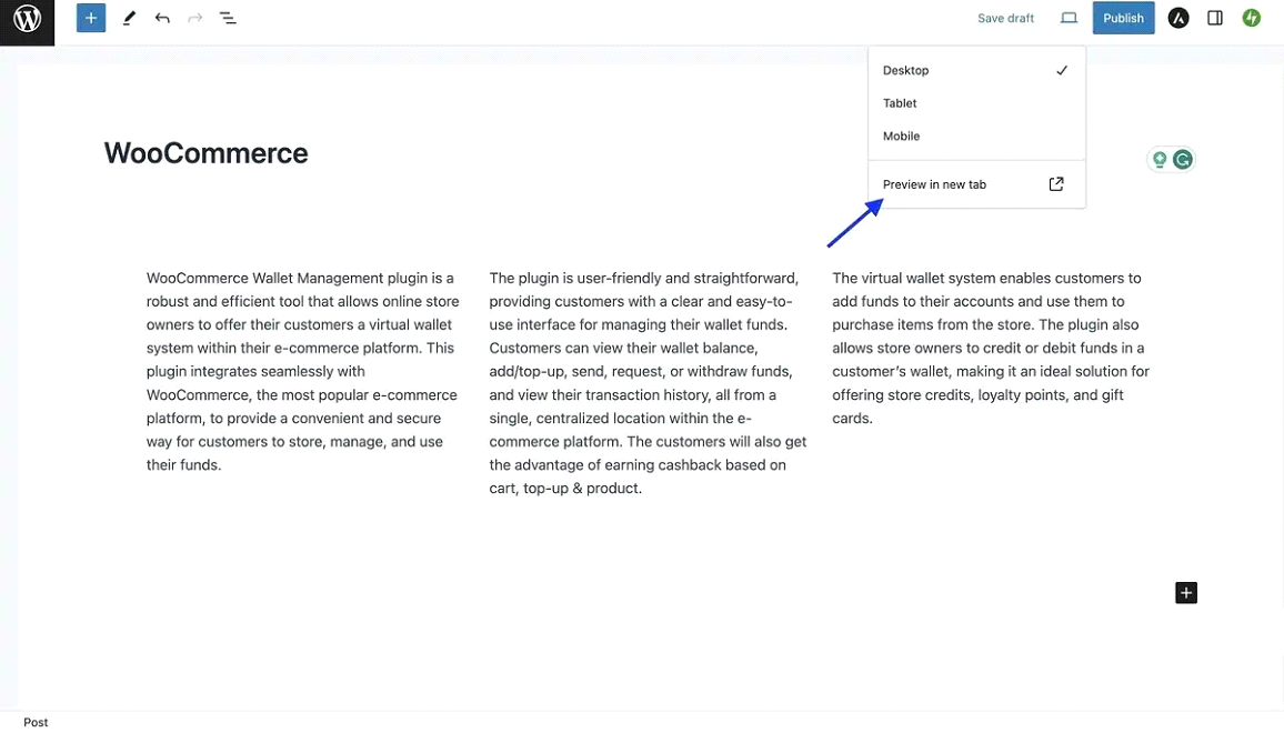
Step 8: Preview and Test
After designing the column layout, preview the page to see how it looks and functions. Test the responsiveness of the columns by viewing the page on different devices (desktop, tablet, mobile) to ensure that the layout adapts seamlessly to various screen sizes.
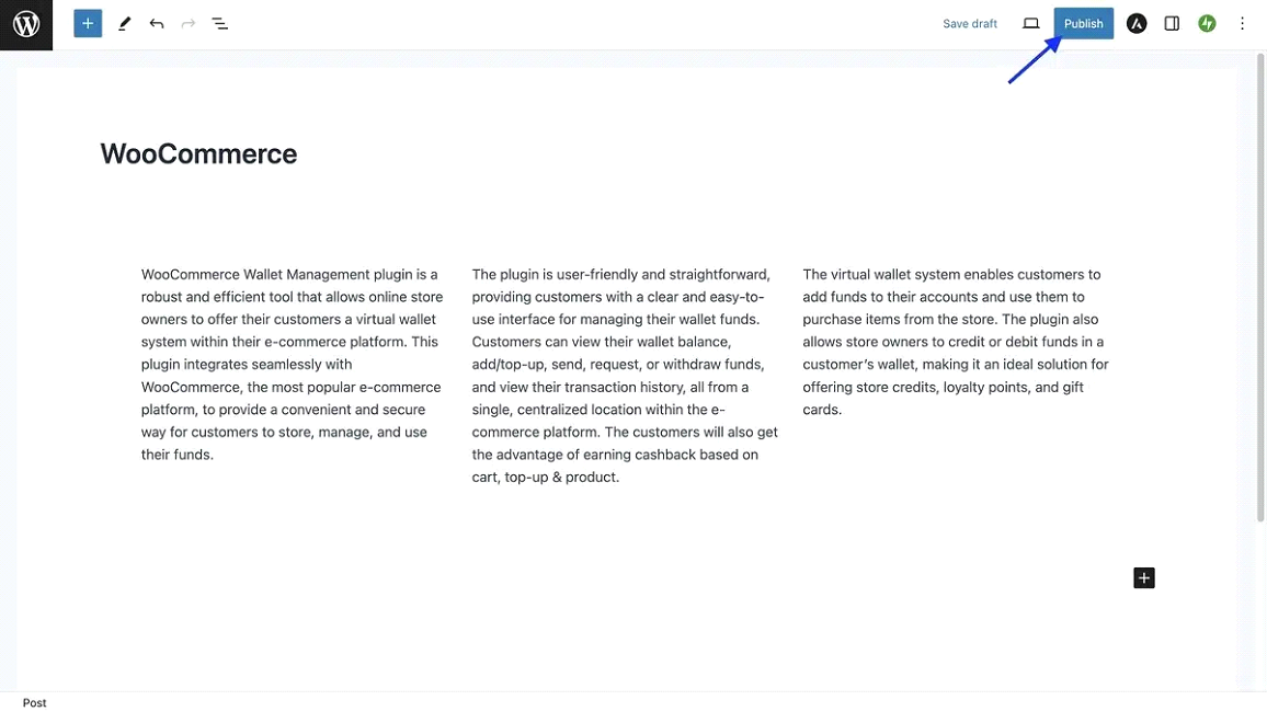
Step 9: Save and Publish Changes
When you are satisfied with the converted layout, save the changes and publish the page or post. Be sure to check the front-end of your site to make sure the new column-based layout displays correctly.
Step 10: Monitor and Fine-Tune
Monitor your site after conversion to keep track of potential problems or necessary adjustments. If necessary, adjust the column layout to optimize usability and visual appeal.
Tips for Backup and Preparation
Thinking yet about how to convert from container to column WordPress? Here are some tips before diving into the conversion process:
- Plan regular site backups so you always have an up-to-date copy in case of emergencies.
- Before making changes to the live site, test conversion rates on an intermediate site. This will allow you to fix any issues without affecting the live site.
- Make sure all plugins and themes are updated before making changes to avoid compatibility issues.
- Refer to the documentation or support resources provided by your page builder plugin for specific advice on creating and customizing columns.
Best Practices for Layout Conversion
While the excitement of a fresh column layout builds, it’s important to keep some best practices in mind to ensure a smooth conversion and a website that functions flawlessly across devices.
- During the conversion process, don’t limit yourself to designing for desktops. Preview your site on tablets, smartphones, and other devices to identify any layout issues that may arise on smaller screens.
- Many WordPress themes and plugins offer built-in responsive design features. These tools allow you to customize column widths, margins, and content placement specifically for different screen sizes, ensuring that your site remains visually appealing and user-friendly on all devices.
- Columns are a fantastic way to break up large chunks of text into snippets that improve readability for your visitors. Aim for concise paragraphs and use bullet points or numbered lists to increase the ease of scanning.
- While columns provide design flexibility, you don’t want to create too many narrow columns or overload them with content. This can overwhelm users and make it difficult to navigate the site. Aim for a clean and balanced layout with enough space for content to breathe.
- Ensure your column layout complements your overall website design. Use similar color schemes, fonts, and design elements throughout the website to create a sense of visual consistency and brand identity.
- During the conversion process, make sure your website’s navigation remains clear and user-friendly. Columns shouldn’t impede the user’s ability to find the information they seek. Consider adjusting your navigation menu placement or design if needed to maintain optimal usability.
- Think about the future of your website. Will you be adding more content in the future? Choose a column layout that’s flexible enough to accommodate future growth and avoid the need for a complete layout overhaul down the line.
Troubleshooting Common Issues
Even the most meticulous website developer can encounter a few bumps in the road during the conversion process.
Issue 1: Layout Issues on Mobile Devices
Solution: Responsive design is key! As mentioned earlier, test your website layout on different devices throughout the conversion process. Use the responsive design features offered by your theme or page builder plugin to customize column widths, margins, and content placement specifically for smaller screens.
Issue 2: Content Overflowing Columns
Solution: Content is king, but so is breathing space! Try not to overload columns with text or media elements. Aim for concise and well-structured content in each column. Consider using additional columns or changing column widths to create a more balanced and visually appealing layout.
Issue 3: Incompatibility with Existing Plugins or Themes
Solution: Outdated plugins or themes can sometimes create compatibility issues. Before making any major changes, make sure all your plugins and themes are updated to the latest versions. If the problem persists, refer to your plugin or theme documentation and support resources to learn how to troubleshoot issues specific to your system.
Don’t be afraid to ask for help! If you encounter a particularly difficult problem that’s out of your comfort zone, reach out to the WordPress support forums, theme developer, or WordPress developer for help.
Wrapping Up
Great! You’ve explored how to convert from container to column WordPress. You’ve taken a significant step towards a more modern and engaging website by exploring the conversion from container layouts to columns in WordPress.
Columns are a flexible framework for organizing and displaying content effectively. They allow you to break down information into easily digestible chunks, improve readability and seamlessly integrate multimedia elements. In addition, responsive design ensures that your website looks great and functions flawlessly on all devices, allowing your audience to stay engaged no matter how they access your site.
The beauty of website design lies in its constant evolution. Don’t be afraid to experiment with different column configurations, content placement, and visual elements to find what resonates most with your audience. There is always an opportunity to learn and improve your website design to keep it fresh and interesting.
Looking for professional help?
If you’d like expert assistance in crafting a beautiful and functional column layout for your website, Webcapitan is here to help. Our team of experienced web designers and developers can transform your vision into reality. Visit our website to learn more about our WordPress services!