Glassmorphism is a UI style where cards, headers and panels look like frosted glass: a translucent fill, a blurred view of whatever sits behind, a thin light edge and a soft, often coloured shadow. Done well, it gives a flat interface a sense of depth, so elements read as layers floating at different heights. Done badly, it turns a website into a fairground: unreadable text, muddy panels stacked on panels, and a phone that stutters when you scroll.
This guide takes the style apart into the few techniques that actually make it work, shows the exact CSS and Tailwind classes we use in client projects, and draws the line where glass stops helping and starts hurting. Everything here applies equally to a marketing site, a SaaS dashboard or a WordPress theme.
What is glassmorphism?
Glassmorphism is a visual style that imitates frosted glass by combining a semi-transparent background with backdrop-filter: blur(), so the content behind an element is visible but softened. It became mainstream with Apple's macOS Big Sur and iOS interfaces and Microsoft's Fluent "acrylic" material, and it has stayed popular because, unlike many trends, it solves a real problem: it shows hierarchy without adding heavy borders or solid blocks.
Flat blocks of solid colour are the fastest giveaway of a template site. Glass and well-built shadows add tactility: cards seem to rest above the background at different heights, and the eye understands what is in front and what is behind before it reads a single word. The style rests on three techniques that work together:
- Glass surfaces: translucent, blurred cards and panels.
- Coloured shadows instead of black ones.
- Layered shadows that imitate how real light falls.
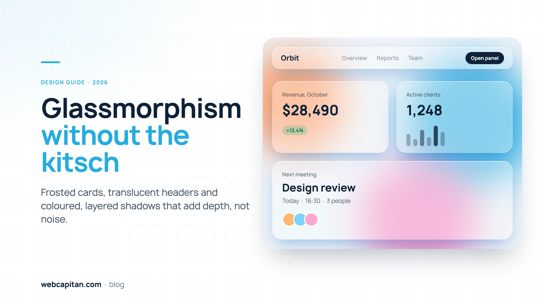
A glass header and cards over a few blurred colour blobs. Every effect in this picture is plain CSS.
The anatomy of a glass card
A convincing glass card is built from four layers: a translucent fill, a background blur, a thin light border and a one-pixel inner highlight. Remove any one of them and the illusion weakens; most "cheap-looking" glass is missing the last two.
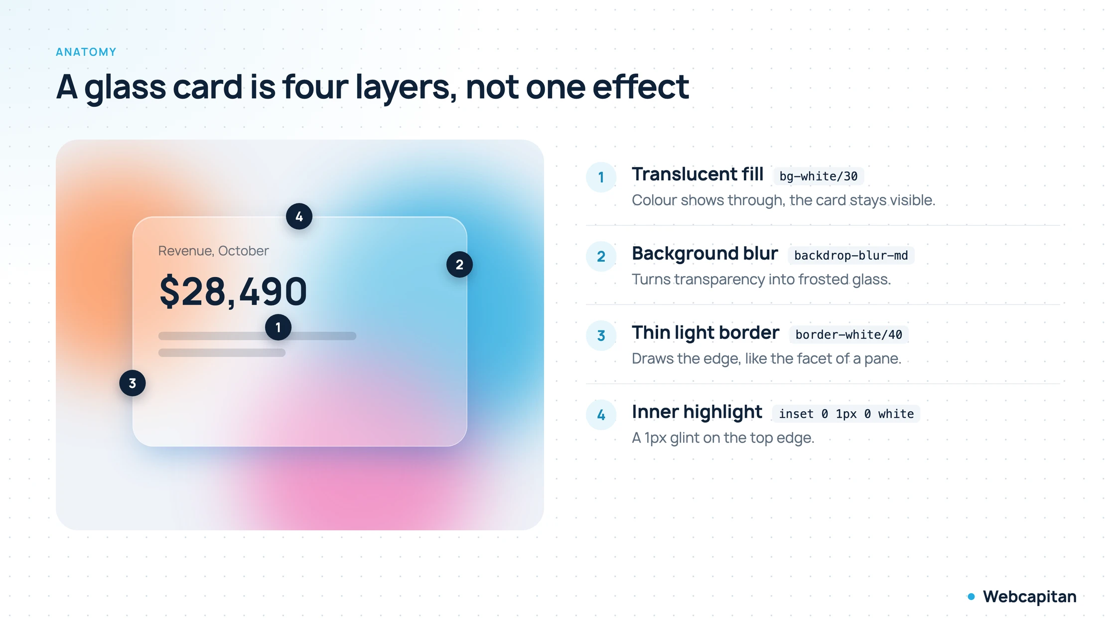
The four layers of a glass card and the Tailwind classes that produce them.
- Translucent fill (
bg-white/30). The card is visible, but colour from behind shows through. Somewhere between 20% and 60% opacity covers almost every case. - Background blur (
backdrop-blur-mdtobackdrop-blur-xl). This is the layer that turns plain transparency into frosted glass. Without it, you just have a pale, see-through box and text fighting with whatever is underneath. - Thin light border (
border-white/10toborder-white/40). It outlines the edge the way light catches the facet of a pane. On dark backgrounds it matters even more, because it is often the only thing separating the card from the page. - Inner highlight (an
insetshadow of one pixel along the top edge). A tiny glint, like light reflecting off the rim. Nobody notices it consciously, but everybody notices when it is missing.
Here is the whole card in plain CSS:
.glass {
  background: rgb(255 255 255 / 0.32);
  -webkit-backdrop-filter: blur(16px) saturate(140%);
  backdrop-filter: blur(16px) saturate(140%);
  border: 1px solid rgb(255 255 255 / 0.4);
  border-radius: 24px;
  box-shadow:
    0 20px 50px -12px rgb(36 140 224 / 0.45),  /* coloured drop shadow */
    inset 0 1px 0 rgb(255 255 255 / 0.5);      /* inner highlight */
}
And the same in Tailwind:
<div class="rounded-3xl border border-white/40 bg-white/30 backdrop-blur-lg backdrop-saturate-150
            shadow-xl shadow-sky-500/40 shadow-[inset_0_1px_0_rgba(255,255,255,.5)]">
  …
</div>
The saturate() step is optional but worth it: blur on its own tends to grey colours out, and a slight boost in saturation keeps the glass looking lit rather than dusty.
The one rule: glass needs colour behind it
Glass only works when there is something colourful behind it to blur. On a flat grey or white background there is nothing to soften, so a glass card simply looks washed out, like a faded solid block.
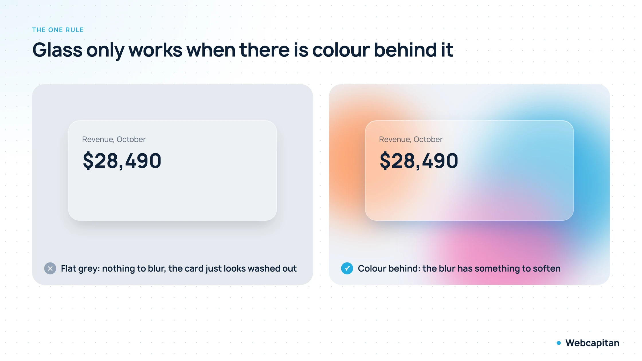
Identical CSS on both sides. Only the background changes.
That is why almost every glassmorphism example has blurred colour blobs, a gradient mesh or a photo behind the cards. You have several options, from cheapest to richest:
- Two or three blurred circles positioned absolutely behind the content (
blur-3xl, 60–80% opacity). Cheap, flexible and easy to keep on brand. - A mesh gradient as a background image. One request, no extra DOM, works well for a hero section.
- A photograph or product shot. The most natural fit for a glass header or a caption card sitting on top of an image.
- Slow-drifting blobs animated with
transform. Lovely on a landing page, but keep the motion slow, and switch it off underprefers-reduced-motion.
Pick the colours from your brand palette rather than from a glassmorphism generator. Two brand colours plus one warm accent usually look intentional; five saturated neons look like a screensaver.
Glass headers, menus and modal panels
The most useful place for glass is on elements that float above the content: sticky headers, dropdown menus, drawers and modal windows. The blurred backdrop tells people that the page is still there underneath, so they never lose their place.
A solid sticky header hides the content it covers; a fully transparent one makes the menu unreadable over images. A glass header sits in between: text scrolling under it is visible as a soft shape, so the page feels continuous, while the navigation stays legible. For headers we use a much denser fill than for cards, typically 70–90%:
<header class="sticky top-0 z-50 border-b border-black/5 bg-white/80 backdrop-blur-md">…</header>Modals and drawers follow the same logic. Blur the page behind the dialog with a light overlay (bg-black/10 plus a glass panel on top) and the user keeps a sense of context: they can see the dashboard they came from, just out of focus. This is far gentler than the classic 60% black overlay, which feels like the lights went out.
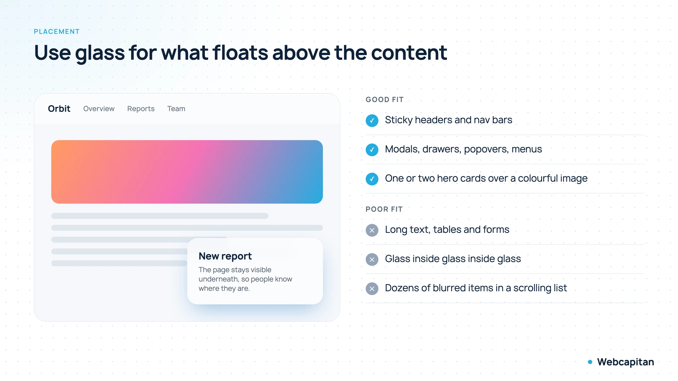
Glass earns its place on layers that sit above the page, not on the page itself.
Coloured shadows instead of black
A coloured shadow, tinted with the hue of the background or your accent colour, reads as light passing through glass, while a black shadow on a colourful background looks like a dirty stain under the card.
Real shadows are never pure black: they pick up the colour of the surface they fall on and the light around them. When a card floats over a blue-and-pink background, a grey-black shadow is physically wrong, and the eye registers it as "cheap" even if nobody can explain why. Tint the shadow instead:
- Use the same hue as the dominant background colour or your accent, but more saturated and darker.
- Keep opacity moderate, around 25–45%, and use a negative spread (
-12px) so the shadow sits under the card instead of haloing around it. - In Tailwind this is a two-class job:
shadow-xl shadow-sky-500/40.
On a plain white page, a very subtle tinted shadow (navy or brand blue at 8–15%) still beats neutral grey: it makes the whole interface feel warmer and more deliberate.
Layered shadows for real depth
Layered shadows stack several box-shadows of increasing size and blur, so the shadow is dense and sharp right next to the element and soft and wide further away. That is how shadows behave in the physical world, and it is what makes height believable.
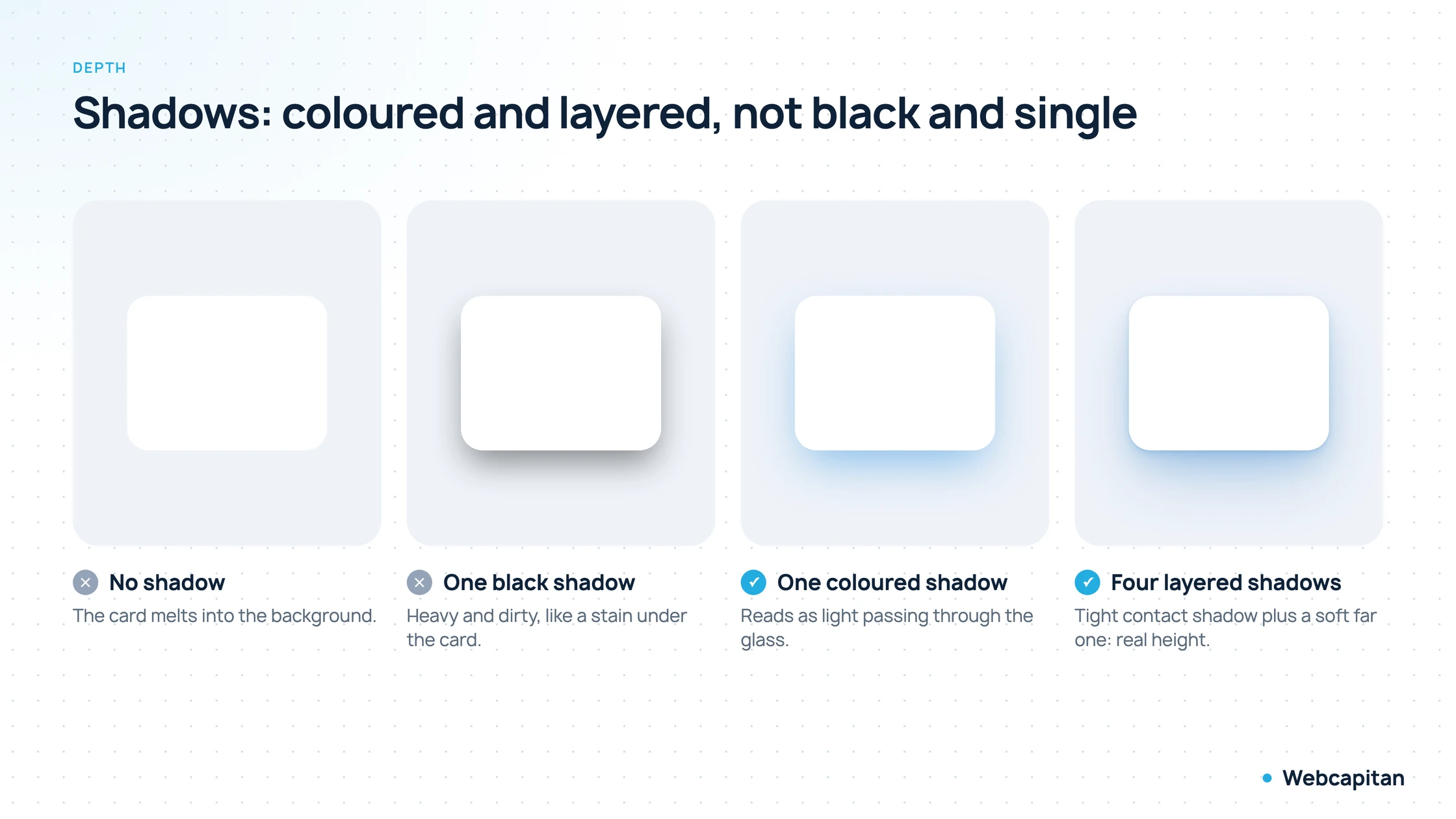
From left to right: flat, heavy, coloured, and layered. The last one is the only one that looks like it is actually lifted off the surface.
A single box-shadow is a single blurred blob. Stacking four gives you a contact shadow, a mid-range shadow and a long ambient one:
box-shadow:
  0 1px 2px   rgb(36 120 200 / 0.14),
  0 4px 8px   rgb(36 120 200 / 0.12),
  0 16px 32px -4px  rgb(36 120 200 / 0.20),
  0 36px 70px -14px rgb(36 120 200 / 0.32);
Tailwind's shadow-2xl is a decent starting point, but for a product with a design system we usually define three or four elevation tokens (resting card, raised card, popover, modal) as layered shadows and use only those. Consistent elevation does more for perceived quality than any single clever shadow.
Recommended settings at a glance
These values are where we start on most projects; adjust them against your real background and content rather than in isolation.
| Element | Fill | Blur | Border | Shadow |
|---|---|---|---|---|
| Card on a colourful hero | white 25–40% | 12–20px | white 30–40% | coloured, layered |
| Sticky header | white 70–90% | 8–12px | black 5% bottom only | none or very soft |
| Modal / drawer | white 55–75% | 20–30px | white 40% | layered, larger |
| Card on a dark background | white 6–12% | 16–24px | white 10–20% | coloured glow |
Glass on dark backgrounds
On dark backgrounds glass needs far less fill, around a third of what you would use on light, and the border does most of the work of defining the card.
A 35% white fill that looks elegant on a pale background turns into a milky grey slab on navy. Drop it to 6–12%, keep the light border at 10–20% so the edges stay crisp, and soften the inner highlight. Coloured shadows become a gentle glow rather than a shadow, which suits dark interfaces perfectly. If you support both themes, define the glass values as CSS custom properties and swap them in your dark-mode block instead of maintaining two sets of classes.
Where glass turns into kitsch
Glass becomes kitsch when it costs readability, when it is stacked several layers deep, or when it is applied to everything on the page.
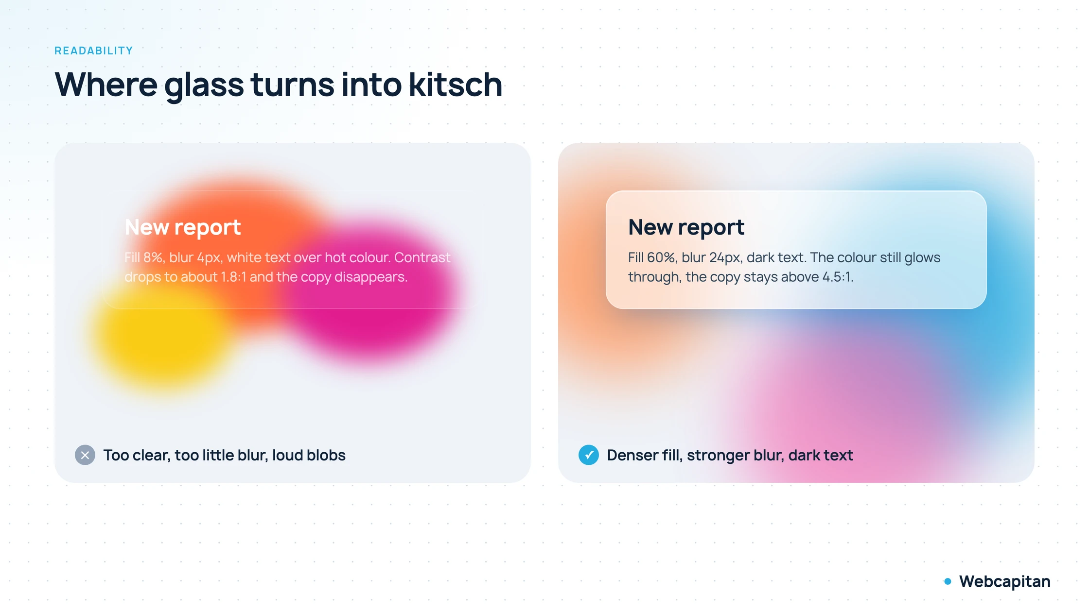
The same component with different numbers. Readability is a setting, not a matter of luck.
- Unreadable text. If a bright blob shines straight through a card, small text disappears. Keep the fill at 25–30% or higher, increase the blur, and check contrast against the brightest point behind the card, not the average. WCAG asks for 4.5:1 for body text; on glass that usually means dark text on a light fill or a darker, denser panel.
- Glass on glass. A glass card inside a glass panel inside a glass window is murky water. One glass layer per stack is enough; anything nested inside it should be solid or simply transparent.
- Glass everywhere. If every card, button and badge is frosted, nothing stands out and the page loses its hierarchy. Reserve glass for the few elements that genuinely float.
- Long-form content. Articles, tables, pricing details and forms belong on solid surfaces. Reading paragraphs over a moving, blurred background is tiring.
- Too many effects at once. Glass, a neon glow, a gradient border and a 3D tilt on hover is four trends in one component. Pick one star effect per screen.
Performance and browser support
backdrop-filter is supported in every current browser, but it is rendered on the GPU and gets expensive when many large blurred elements are on screen or animated at once.
Chrome, Edge and Firefox support the unprefixed property; Safari needed -webkit-backdrop-filter until version 18, so keep the prefix for older iPhones. A few practical rules keep things smooth on budget Android phones:
- Limit glass to a handful of elements per viewport. A sticky header plus two or three cards is fine; a scrolling list of fifty frosted rows is not.
- Do not animate the blur radius itself. Animate
opacityandtransformon the glass element instead, which the browser can composite cheaply. - Keep blur radii reasonable. Going from 16px to 40px rarely looks better, but it does cost more.
- Provide a solid fallback for browsers or modes without blur:
.glass { background: rgb(255 255 255 / 0.85); }

@supports (backdrop-filter: blur(1px)) or (-webkit-backdrop-filter: blur(1px)) {
  .glass { background: rgb(255 255 255 / 0.32); backdrop-filter: blur(16px); }
}
Accessibility checklist
Glass is accessible as long as text contrast holds against the busiest part of the background and the effect can be reduced for people who ask for it.
- Contrast. Test with the background in its worst position, especially if the blobs move. Tools like the Chrome DevTools contrast picker sample what is actually rendered.
- Reduced transparency. macOS, iOS and Windows let users turn transparency down. Respect it with
@media (prefers-reduced-transparency: reduce)by switching glass to an opaque fill. - Reduced motion. If the colour blobs drift, stop them under
prefers-reduced-motion: reduce, or replace the drift with a static layout. - Focus states. A thin white border is not a focus ring. Interactive glass elements still need a clearly visible
:focus-visibleoutline.
A prompt for AI-assisted builds
If you prototype with an AI coding assistant, spell out every layer and every limit, otherwise you get heavy blur on everything and black shadows.
Build cards in a glassmorphism style: backdrop-blur-lg, a semi-transparent
white fill (bg-white/30), a 1px inner top highlight and a subtle border
(border-white/40). Make the sticky header and modal panels translucent with
blur, using a denser fill (bg-white/80). Replace hard black shadows with soft
coloured, layered shadows in the brand blue. Put two or three large blurred
colour blobs behind the content so the glass has something to show. Keep body
text at 4.5:1 contrast, no glass nested inside glass, and add a solid fallback
for prefers-reduced-transparency.
Summary
Glassmorphism works when it is used sparingly and with a clear purpose: to show which layers float above the page.
- Glass = translucent fill + background blur + thin light border + inner highlight.
- Without colour behind it, glass does not work.
- Shadows should be coloured and layered, not black and single.
- Use glass for what sits above the content: headers, menus, drawers and modals.
- Protect readability and performance first; the effect comes second.
Want a site or product interface with depth that still reads clearly and loads fast on a cheap phone? Our UI/UX design team builds design systems with elevation, colour and motion tokens that developers can ship as is. Tell us about your project, or read how we approach front-end development.
About the author

CEO & Founder, Webcapitan
Roman Yashchuk founded Webcapitan in 2014 and leads the team of 22 designers and developers in Vinnytsia and London. He works hands-on in UI/UX design, WordPress and PHP/Laravel development, and writes about choosing platforms, costs and keeping websites fast and secure.
All articles by Roman Yashchuk